Stackzilla: A Bold Display Font for Digital Brand Impact
As a UI designer who ships landing pages, SaaS dashboards, and e-commerce experiences daily, I treat typography like interface logic — every choice affects scanning speed, emotional resonance, and conversion clarity. That’s why Stackzilla stands out in my font library: it’s not just decorative; it’s a deliberate tool for establishing visual hierarchy and tonal authority across digital touchpoints.
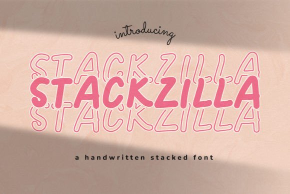
Stackzilla is a confident, high-contrast display font with strong geometric structure and subtle organic warmth. Its uppercase-heavy character set features clean terminals, balanced negative space, and just enough personality to avoid sterility — without sacrificing legibility at scale. It leans modern but avoids trend fatigue, making it ideal for brands that want to feel current *and* timeless.
In practice, Stackzilla excels where attention must be directed: hero section headlines, product name treatments, CTA buttons on conversion-focused landing pages, and banner text over high-res imagery. Its generous x-height and open counters ensure readability even at 32px on mobile viewports — critical when users scroll vertically on small screens. On dark backgrounds, its contrast holds up cleanly; over light overlays or soft gradients, it maintains presence without harshness.
It’s not built for body copy. Stackzilla is a display font — purpose-built for short-form impact. Think: “Limited Time Offer” banners in your online store, the headline above your course sales page, the bold tagline in your portfolio hero, or the branded header on your coaching website’s testimonial section. Using it for paragraph text would disrupt rhythm and accessibility. But deployed precisely — as a headline, logo lockup, or section divider — it reinforces brand voice instantly.
I’ve used Stackzilla successfully in three distinct contexts: a boutique skincare brand’s Shopify homepage (paired with Inter for body text), a no-code SaaS tool’s feature comparison table (where Stackzilla labels each column header), and a creative workshop’s email campaign banners (rendered as SVG text for crisp rendering across devices). In each case, the font elevated perceived professionalism while keeping tone approachable — never cold, never childish.
For visual hierarchy, Stackzilla’s weight and spacing naturally draw the eye upward. When placed above supporting sans serif copy — say, Inter, Manrope, or IBM Plex Sans — it creates clear information architecture. Users scan the Stackzilla headline first, then drop into supporting details. This behavior directly supports usability goals: faster comprehension, reduced bounce rates, and stronger message retention.
Pairing matters. Stackzilla works best with neutral, highly legible sans serifs for UI text and paragraphs. Avoid competing display fonts — no script or handwritten companions in the same layout. For editorial-leaning sites (like a design blog or newsletter), try pairing Stackzilla headers with a warm serif like Public Sans or Source Serif Pro for body copy. The contrast adds sophistication without visual noise.
Check what’s included before licensing. Stackzilla ships with standard OpenType features, multiple weights (Light, Regular, Bold), and full Latin character support — sufficient for most English-language web projects, SaaS interfaces, and digital marketing assets. If your audience includes multilingual users beyond Western Europe, verify extended glyph coverage — some display fonts limit diacritics or punctuation variants.
Webfont delivery is straightforward: WOFF2 files are optimized for fast loading, and the font performs well with @font-face declarations in CSS. For performance-sensitive projects, load Stackzilla only where needed — for example, conditionally loading it on hero sections and marketing pages, while defaulting to system fonts elsewhere. Always declare fallbacks: font-family: "Stackzilla", -apple-system, BlinkMacSystemFont, "Segoe UI", sans-serif;
Readability on small elements requires care. While Stackzilla shines at 48px+ in headers, avoid using it below 24px — especially in buttons or mobile navigation. On iOS, tiny Stackzilla text can appear slightly pixelated without proper antialiasing hints. Test across devices: if a “Get Started” button feels cramped or hard to tap, switch to a simpler sans serif at that size. Reserve Stackzilla for moments where brand emphasis outweighs functional density.
Licensing is non-negotiable. Stackzilla is a premium font — and its commercial license covers web use, client projects, online stores, digital templates, and brand asset kits. Don’t assume free download = free for production. Verify whether your license permits embedding in hosted apps, white-labeled dashboards, or downloadable PDF brand guidelines. Most reputable vendors offer clear tiered plans: one-site, multi-site, or extended enterprise use.
For creative entrepreneurs building their own digital identity — whether launching a course platform, redesigning a portfolio site, or crafting social media graphics — Stackzilla delivers consistent tone across formats. Used once in a logo, it sets expectations. Used again in a webinar banner, it reinforces recognition. Used a third time in an email subject line preview, it builds familiarity. That repetition — anchored by typographic consistency — is how digital brands earn trust without saying a word.
Ultimately, Stackzilla isn’t about being “cool.” It’s about being *strategic*: a display font that earns its place in your design system by solving real problems — guiding attention, expressing brand confidence, and holding up across devices and contexts. When your headline needs to land — not just look good — Stackzilla delivers clarity, character, and quiet authority.